Got a website? Great! Your clients have a place to come and find out about how you can solve their problems, be it buying gifts for their friends or ramping up their small business productivity.
Here’s another question: Does your website have landing pages?
If you’re raising your eyebrows in confusion, don’t panic! Landing pages are easy to set up and can make a huge difference to your lead generation.
What’s a landing page?
Your website has its Home page, About page, Contact page and probably a few other pages explaining what you do and why / how you do it. These pages are interconnected, flowing from one to the other via the top navigation bar.
A landing page is a little different. It is designed to stand alone, with the sole objective of collecting visitor information. Once you have helpful details like emails and phone numbers, you can use them to get in touch with your clients and really show them how you can make a difference to their lives.
When you create a landing page, it should have a solitary sales message.
For example, an accountant may be planning a workshop teaching young people how to stay organised and prepare for tax time. While this accountant’s business no doubt offers a range of other services, the landing page will focus on the workshop, explaining the benefits and inviting clients to put their names down for the event.
The reason landing pages are widely recommended in the world of marketing is that they narrow the sales funnel. Your Homepage and your About page are great for people who want to know more about your company. With a landing page you can refine what you have to offer and show the website visitor in clear detail how you can help them.
Once a user reaches a landing page, they don’t have to click around trying to figure out how to get in touch or find out more. You have already made it simple.
The elements of an effective landing page
Landing pages are a great strategy, however they do have to be executed well to help you win more clients. Without the right components on your page you won’t be able to direct those visitors down the funnel and convert them into clients.
Take a look at what you simply must include for an effective landing page:
A catchy headline
Your opening statement is everything. It must clearly display that you understand what your customer is looking for and that you can provide it.
Here’s a couple of not so great landing page headlines:
“We’ve been in business for 20 years”
“Imaginatively capturing elements which lead to greatness”
“Tried. Tested. Trustworthy”
These either don’t speak directly to the user, they don’t give a clear picture of what the product on offer is or they don’t explain how they are a solution to someone’s problem.
Here are some much better examples:
“Enrol and study from home”
“Find flights at crew member prices”
“Get loan approval in 24 hours”
With each of these headlines, the customer can clearly understand the benefits of your product. Depending on your brand, you can play around and have a little fun but the clearer your message is, the better.
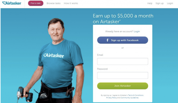
[Airtasker spells it out, clear and simple (and how cool is the dude with the powertool?)]
Compelling text
Your landing page does not have to have reams of copy. However, the copy it does have must present a compelling argument for your user to take the next step and share their details with you.
Different businesses have different strategies when it comes to the copy they use. You can choose from the following options:
- Use a few well-crafted paragraphs to identify customer pain points and show how you can provide a solution.
- Use bullet points or checklists to clearly present the benefits of your product.
- Space your content in ‘chunks’ across the page, as Airtasker has done in this example:

[Keep it clear and keep it simple]
When writing your content, less is more. Stick to ‘active’ language (e.g. find / match / buy / succeed) and speak directly to the customer (e.g. ‘We can fix your problem’ vs ‘We can fix our clients’ problems). Remember that people tend to skim web pages, often on their phones, so use clear subheadings to share key information.
Great graphics
Smiling people are attractive things!
When selecting images for your website, choose pictures that are appealing. Try to use people who are looking directly at the user and smiling.
If you like, you can also play around with animation and cartoons, the way language site Duolingo has done on their ‘Learn French’ landing page.

[Cute animations can be as effective as pictures of real people]
The graphics you use should match what’s on the rest of your website, reflecting your target demographic and following your brand guidelines.
A form
This is where the magic comes into play. When you add your user form, keep it simple by limiting the information you request.
Many sites only ask for an email address, which means users can sign up in a matter of seconds. Others only require a postcode to draw the user into the sales funnel.
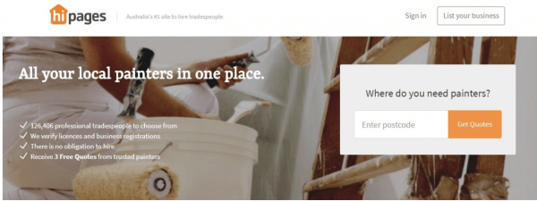
[hipages asks its users where they live]
Once you have created your form, make sure you test it to make sure it works! Often businesses lose money because their form isn’t functioning properly and they don’t realise.
A call to action
What do you want your user to do? Sign up? Claim a sample? Lodge an enquiry?
Your call to action tells them to do it in only a few words and does it in button form so they can click to make things happen.
You can have more than one to action buttons on your page to make it easy for your users to find it and click. However, try to have one as close as possible to the top of your page. Ask your web designer to lock it into place so it will remain discoverable as the user scrolls down.
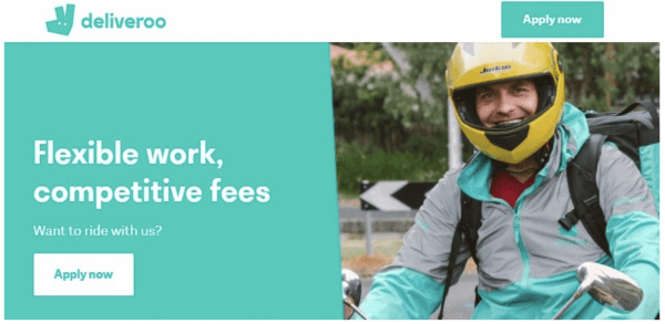
[Deliveroo has two clear CTA buttons on their delivery driver landing page]
Nice-to-haves
Depending on the design of your landing page, there are other options which can be the icing on the cake.
You may wish to include some of the following:
Testimonials / Review
Social proof is a powerful tool, particularly when it comes to kicking people’s decision making process into gear.
Adding testimonials from real people can make a big difference when they visit your landing page. Ask your current clients for testimonials to use on their website or check out reviews that customers have left on sites like Google / Yelp / True Local and repurpose them for your landing page.
You can also find widgets online which will draw in review from sites like LinkedIn. This works because it proves you have not used ‘creative licence’ to write your own reviews (PS never do that).
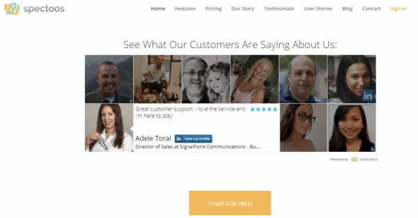
[Spectoos is a social media review widget which uses its own product to post testimonials on its website]
Awards / Big brand associations
If you have won any awards or had exposure with big name publications, your landing page is a good place to share this information.
When your name is associated with a recognisable brand or award, it adds credibility. Along with testimonials, this kind of content can boost client’s trust levels.
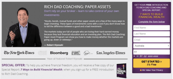
[Rich Dad’s landing page shares details of major publishers]
As much as possible, use the logos of brands which are instantly recognisable to your customers.
Video
Video is fast taking over as a winning strategy on websites and across social media.
If you’re putting a video on your landing page, have it professionally produced so it looks great and is compelling. Cap the length at one to two minutes and have the video echo the purpose of your landing page, with a clear message, great images and a call to action.
An added bonus of placing a video on your page is that it has the power to boost ‘time spent’. The longer a user stays on a page, the more Google thinks the content is interesting and valuable. This helps to increase your organic SEO ranking.
If you are producing a video for your business, see if you can grab a couple of customers to share their testimonials on camera and up the #cred.
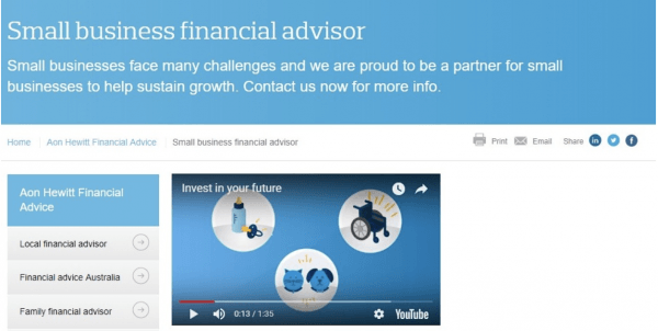
[Even a less than inspiring landing page can grab user attention with the help of video]
A special offer
Getting your customers to want to buy is great. Getting them to want to buy right now is even better.
One option for your landing page is to include a time-limited offer that creates a sense of urgency. This could include a cut-off date or a countdown timer. You can also remind customers that stocks are limited or only a few places are available.
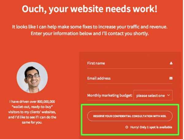
[Neil Patel is the master of all things digital marketing. Is there really only one left? Better book now, just in case]
According to Hubspot, 92% of marketers find landing pages to be effective. With the right combination of factors, you will be able to use yours to bring in hot leads, build your database and increase your sales.
Get in touch with Win More Clients for help creating a landing page which skyrockets your customer base and your conversions.
Related Tag: Sales Automation Consultant

